WipEout HD
︎︎︎
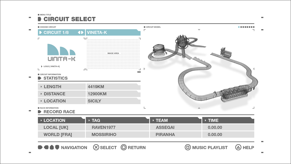
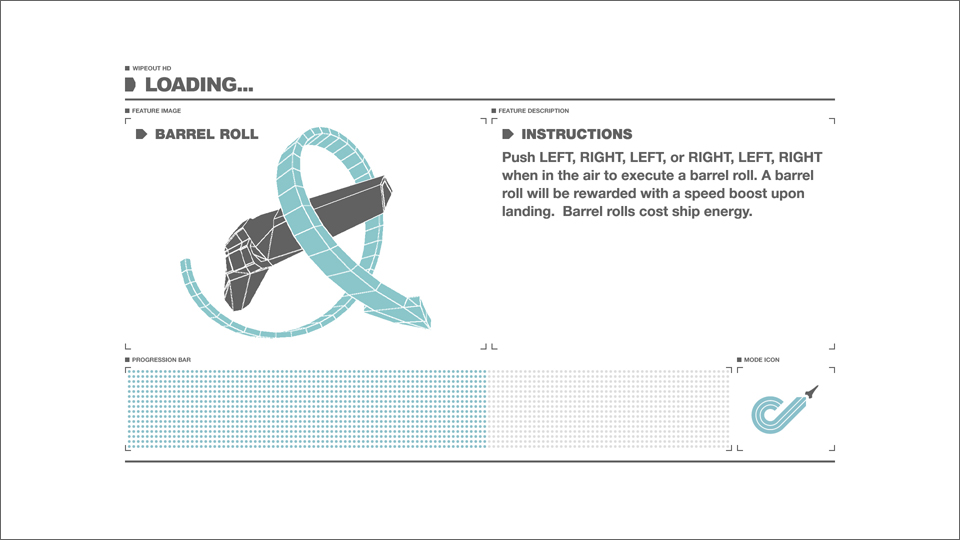
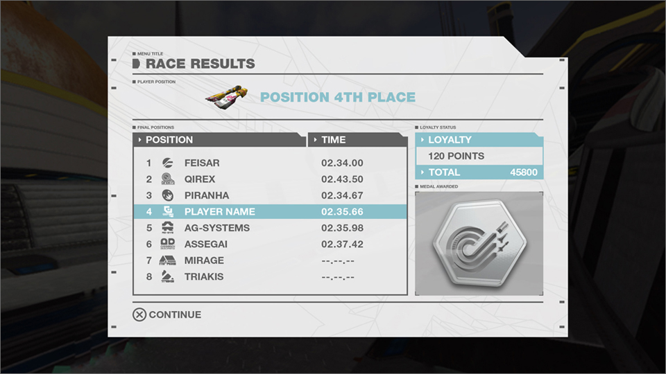
User Interface
A “Future Minimalistic” User interface.
Using classic SCI FI movies such as 2001 AD, i-robot and the previous games aesthetics as an influence. I created a minimalistic style menu system. Using muted colours and bold shapes, it helps to contrast with the games vibrant colours and new HD graphics and give it the visual impact the game deserved.
The Video you see here is the original Previs concept.
WipEout HD User Interface
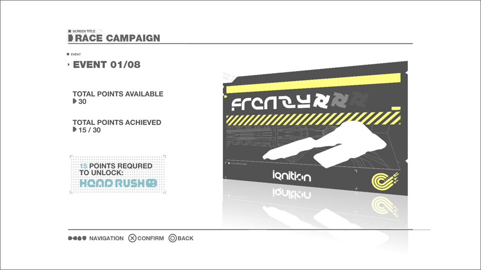
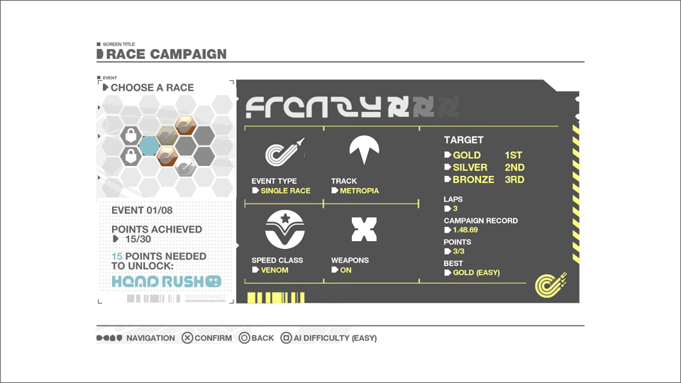
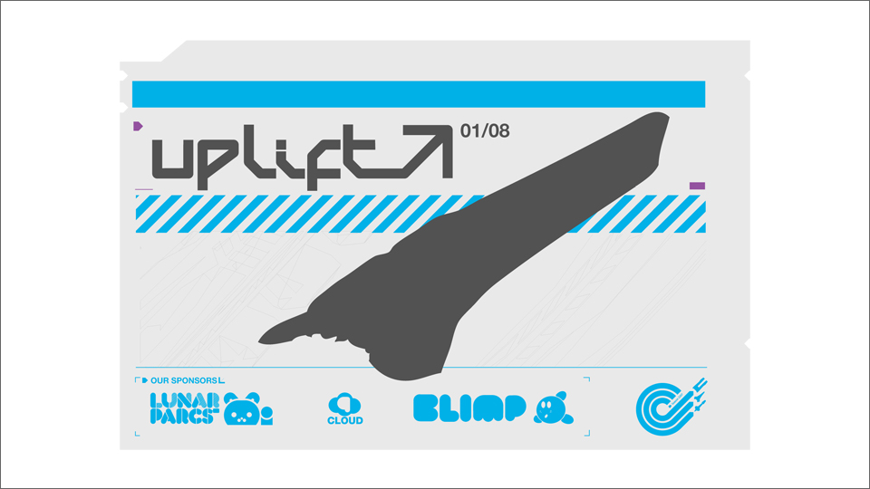
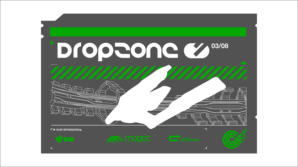
The main concept for the campaign mode is a series of animated “club flyers.” As WipEout’s roots are heavily tied to Europe's clubbing culture and dance scene. Each flyer has a number of races and game modes to complete before the player can unlock the next one.

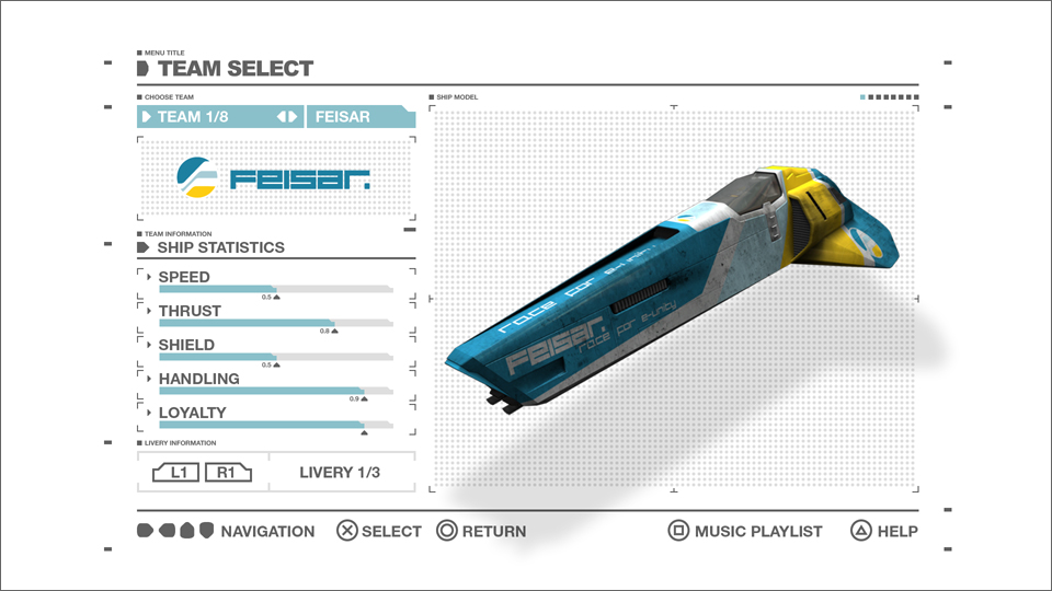

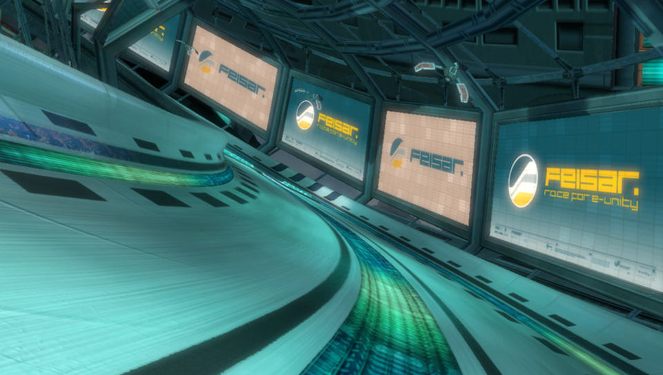
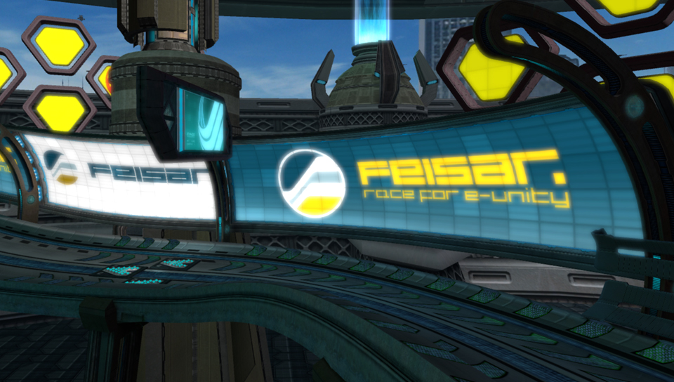
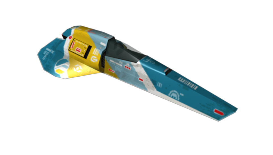
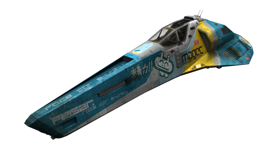
WipEout Racing Team Identities
12 Brand identities for the iconic antigravity racing teams. For each one I worked on re branding the teams from previous games and then applying the new brand to in-game billboards, logo animations, vehicle livery and promotional material.
Created initially for WipEout Pulse then developed for WipEout HD & Fury. These were also later used in the Omega Collection on PS4 brought to life by Clever Beans.
The Video you see to the left is a compilation that appeared on the WipEout Museum in Playstartion Home. (Music by Ian Sidor)
Created initially for WipEout Pulse then developed for WipEout HD & Fury. These were also later used in the Omega Collection on PS4 brought to life by Clever Beans.
The Video you see to the left is a compilation that appeared on the WipEout Museum in Playstartion Home. (Music by Ian Sidor)
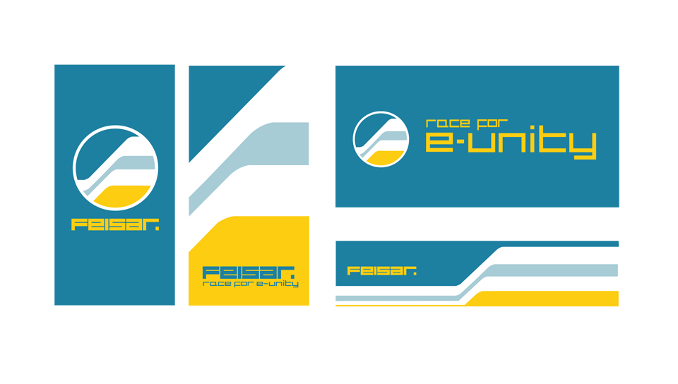
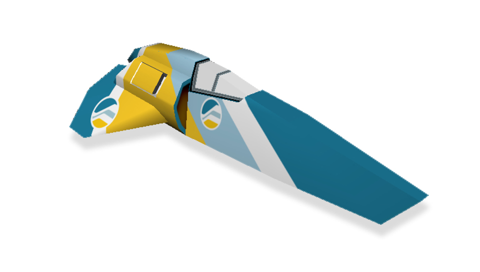
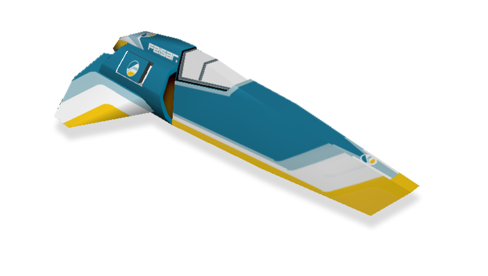
Feisar
The Logo concept is a simple and bold F shape. (a natural development from previous Feisar logo's)
I also came up with the team’s slogan. "Race for E-Unity" a play on words from the game’s lore. Feisar are from the "United European Federation" They are also deemed one of the friendlier AG teams.
Click here to view